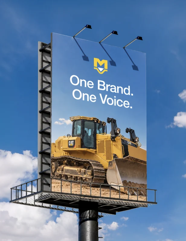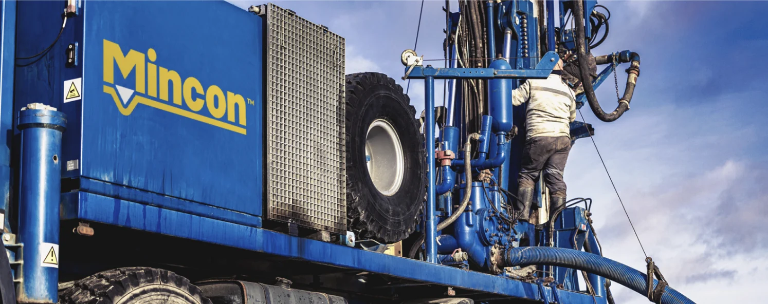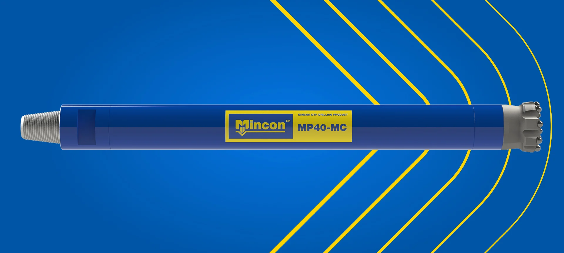
Mincon has been the driller’s choice since 1977, but its identity hadn’t kept pace with the business. The logo was overly detailed, boxed in, hard to read at small sizes, and its gold struggled on white. We evolved the mark rather than replacing it, keeping the equity drillers recognise while making it simpler, warmer and ready for digital, then built a graphic language around it that works from hard hats to homepages.
“Mincon’s mark had decades of trust built into it, so throwing it away was never the answer. We took our cues from the drill bit itself, softening the edges the way conical teeth are rounded, and ended up with a logo that feels familiar to drillers but finally works everywhere it needs to.”
— Darryl Betz, Art Director, Madcraft
01.
The change
Mincon grew from a single DTH hammer specialist into a global group serving mining, construction, geotechnical, water well and geothermal drilling, but its identity was still built for print and a single blue background.
02.
The challenge
The logo scored poorly on simplicity, adaptability and digital readiness. The “M” symbol was too intricate to work alone, the mark only held up inside a blue box, and the Pantone 108 gold lacked contrast on white. Against peers like Sandvik and Epiroc, the brand looked dated.
03.
The strategic decision
We chose evolution over revolution. The “M” and drill bit were simplified, the letterforms were softened using the rounded profile of a drill bit’s conical teeth, and the gold shifted to Pantone 7405 so the logo works on white. A new triangle-based graphic language, drawn from vertical and horizontal drilling, ties everything together.