Evolving a Global Drilling Brand for a Digital-First Market
- Evolved Logo
- Colour Palette
- graphic Language
- Full Branding Suite
Industry
Industrial Equipment & Machinery
Platform
Brand Evolution
Region
 Canada
About the Client
Global Drilling Tools Manufacturer
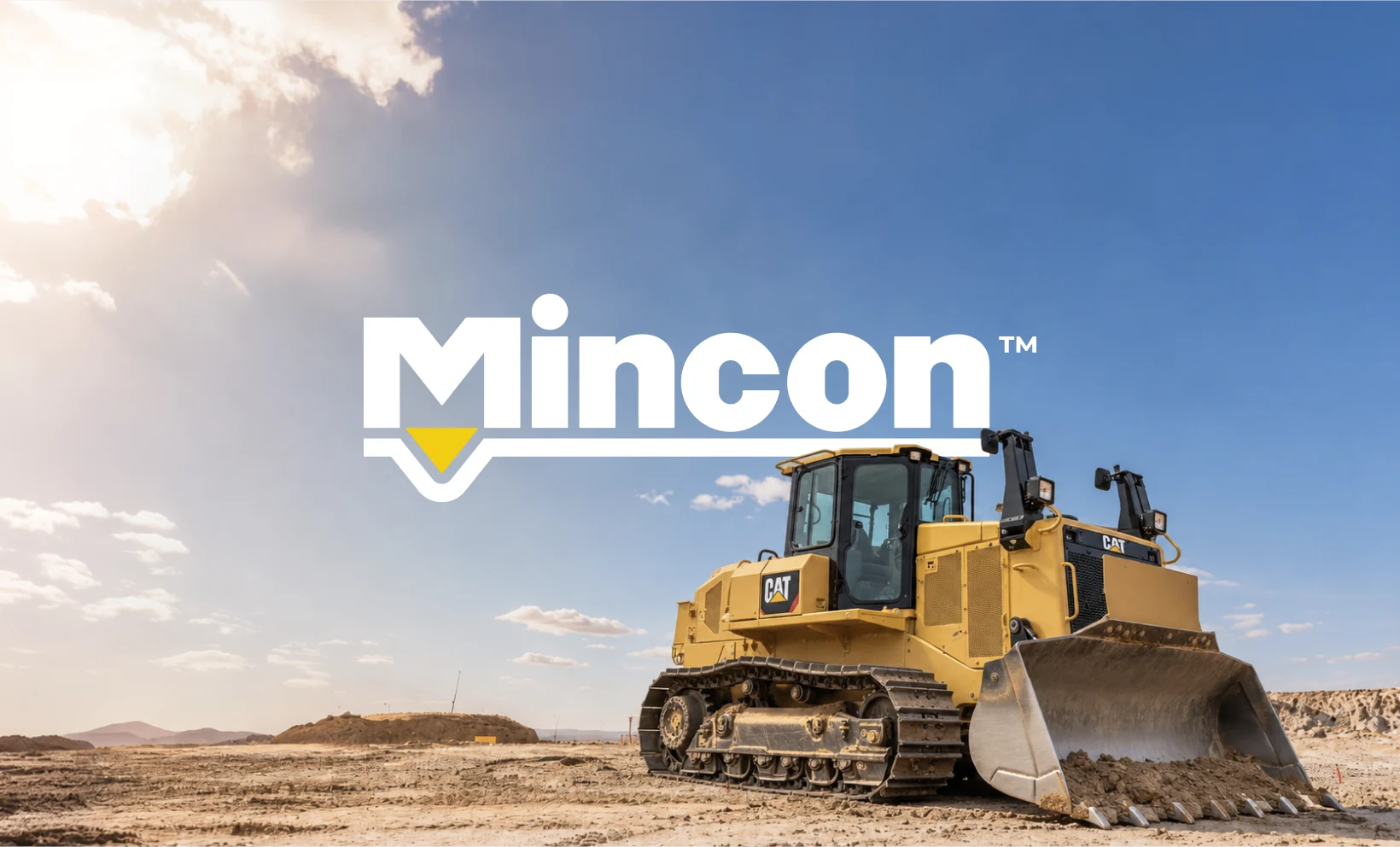
Mincon is a manufacturer of down-the-hole (DTH) drilling hammers, bits and drilling solutions, serving customers across mining, construction, geotechnical, water well and geothermal drilling. Known in the industry as “The Driller’s Choice”, the business is built on decades of engineering expertise and a reputation for products that perform in the toughest ground conditions.
Mincon’s identity had served it well, but it was built for a different era. The brand needed to evolve to work across today’s digital channels without losing the recognition and heritage it had earned on drill sites around the world.
Clients Challenges
Mincon’s existing logo was strong and recognisable on the drill site, but it was showing its age in a digital-first world. Our audit of the current identity uncovered several intersecting challenges:
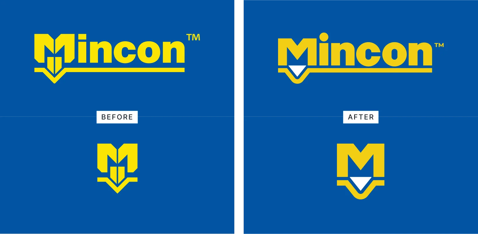
- Simplicity: The “M” symbol was overly detailed, with diagonal cuts on its vertical stems and line spacing between the “M” and drill bit so tight it risked closing up at small sizes.
- Adaptability: The logo relied on a constraining “blue box” and did not perform well on white, limiting how flexibly it could be used across brand touchpoints.
- Digital readiness: The mark displayed poorly on small digital outputs such as favicons, app icons and social profile images.
- Approachability: Hard edges and sharp points throughout the logotype gave the brand a cold, rigid feel at odds with a customer-centric business.
- Colour contrast: The primary gold (Pantone 108) did not contrast strongly enough against white backgrounds.
- Differentiation: In a category crowded with blue-and-yellow palettes and generic “innovation” messaging, Mincon needed a visual language that felt distinctly its own.
The challenge, ultimately, was to modernise a heritage industrial brand without breaking the recognition and trust it had built with drillers worldwide. This needed to be an evolution, not a revolution..
Let’s get started! Contact us today to discover how we can help.
Project Goals
What We Set Out to Deliver
Mincon needed an identity that kept its heritage intact while working harder across every channel. The brief brought together several intersecting goals:
- Simplify the logo, particularly the “M” symbol, so it reads clearly at every size
- Make the identity work confidently on white as well as on Mincon blue
- Create a standalone “M” mark suitable for app icons, favicons and social profiles
- Soften the brand’s character to feel more approachable, without losing its industrial strength
- Refine the colour palette so the primary gold stands out on white
- Benchmark Mincon against its peers to find space for a distinctive look and tone
- Develop a flexible graphic language that could scale across advertising, social, print, product, apparel, signage and web
Our Approach
Discovery & Research
- Audited the current logo against four modern brand criteria: simplicity, adaptability, digital readiness and approachability, scoring each to set a clear baseline
- Identified the "M" symbol as the busiest part of the logo and the priority for simplification
- Carried out a peer aesthetic audit of more than a dozen competitors, including Sandvik, Epiroc, Robit, Hercules Machinery Corporation and Numa
- Analysed peer logos, finding that 75% use a symbol, 25% rely on a wordmark alone and a third depict a literal product
- Analysed peer colour palettes, finding half use blue and a third use yellow, highlighting the need for Mincon to own its colours through execution rather than hue alone
- Mapped peer brand statements, which clustered around reliability, performance, innovation and expertise, against Mincon's more personal, trust-led positioning as "The Driller's Choice"
Logo Evolution
- Filled the vertical gaps in the "M" and drill bit and squared off the "M" stems to remove unnecessary detail
- Fixed tension points between the "M" stems and drill bit corners by dropping the bit below "ground level"
- Lowered the "M" bridge bar to accentuate a feeling of downward pressure on the drill bit
- Rounded hard angles across every character, introduced a circular tittle and rebuilt the counters for consistency
- Evolved the ground line graphic so it carries the same rounded, approachable design language as the new logotype
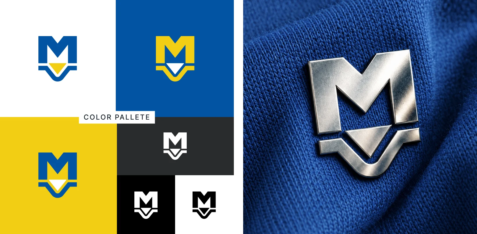
- Introduced Pantone 7405 as the new primary gold so the logo stands out on white, alongside a two-tone logo expression for use on blue
Graphic Language & Applications
- Developed the direction and movement device, the geotechnical contour device and the advertorial frame system
- Tested compositional and textural flexibility so the system can scale from subtle to bold
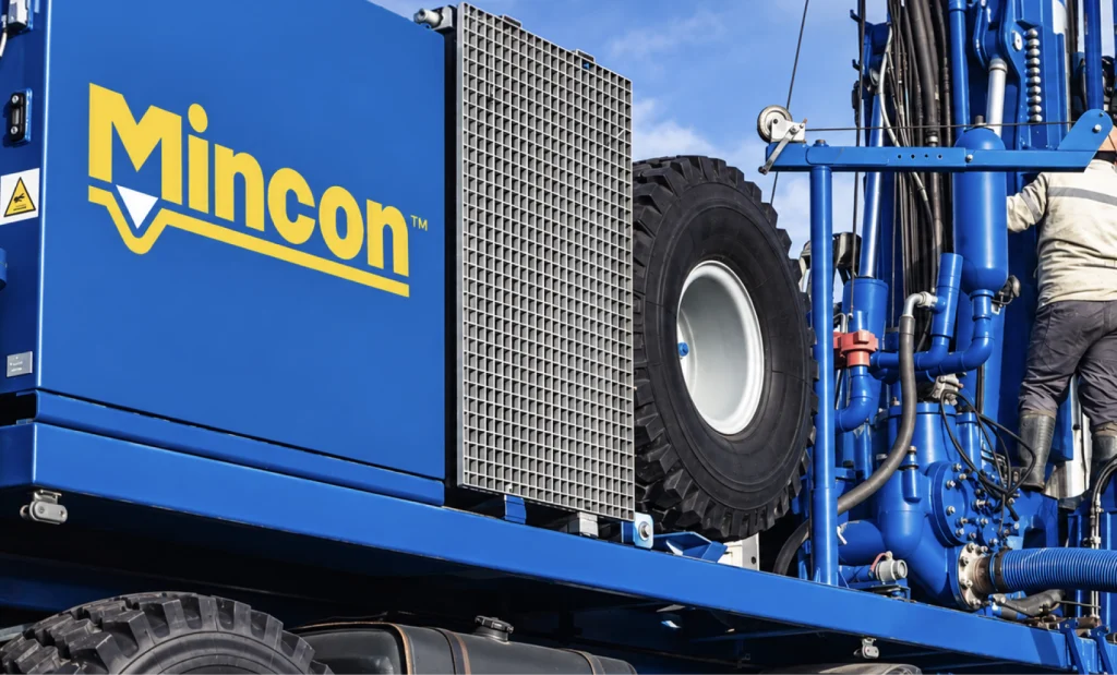
- Applied the evolved identity across advertorial layouts, social media templates, product branding, safety apparel, on-site vehicles, printed collateral, signage, website and mobile designs
- Created a standalone "M" mark for app icons, favicons and social profile images
A Brand Built From the Drill Bit
The standout idea behind the Mincon evolution is that every design decision traces back to the product itself. Rather than borrowing trends from outside the industry, we looked closely at a DTH drill bit and found the brand’s new character in its conical teeth. Their rounded profile became the chief inspiration for softening the logotype: sharp points and hard angles were rounded off, the rectangular tittle on the “i” became a circle, and the skewed capsule inside the “n” was redrawn as a perfectly symmetrical form so every counter in the wordmark shares the same shape and proportion.
The same thinking shaped the wider graphic language. Inspired by the line “We are driven forwards by our love for drilling”, we took the drill bit triangle from the logo and turned it into a system built on direction and movement. A downward triangle represents vertical drilling and a sideways triangle represents horizontal drilling. Converted to keylines and overlapped, the two create a dynamic, flexible device that can be composed in dual or triple arrangements, varied in line weight, and given a rugged, textured finish that speaks to the nature of the industry.
A second device, for geotechnical drilling, surrounds the drill bit icon with rounded contour lines representing the different layers and physical properties of the ground. A third, built for advertorial and social use, borrows the drill bit’s rounded corners and diagonal to create image frames in square, vertical and horizontal formats. For a brand whose customers live and breathe drilling, it means every asset, from a hard hat to a homepage, speaks a language they already recognise.
Key Deliverables
Evolved Logo & Standalone "M" Mark
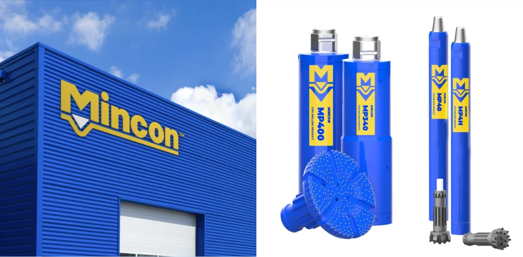
A simplified, softened logotype with a redrawn “M” symbol, a drill bit that now sits below the ground line, and an evolved ground line graphic. The standalone “M” works on its own as an app icon, favicon and social profile image, giving Mincon a consistent mark across every digital touchpoint.
Refined Colour Palette
Mincon blue (Pantone 286) retained as the brand anchor, with Pantone 7405 introduced as the new primary gold for stronger contrast on white, and a two-tone logo expression for use on blue backgrounds.
Direction & Movement Graphic Language
A flexible system of overlapping keyline triangles representing vertical and horizontal drilling, with compositional and textural variations for different levels of impact.
Geotechnical & Advertorial Devices
A contour-line device for geotechnical drilling communications and a family of drill-bit-inspired image frames in square, vertical and horizontal formats for advertising and social media.
Full Brand Applications Suite
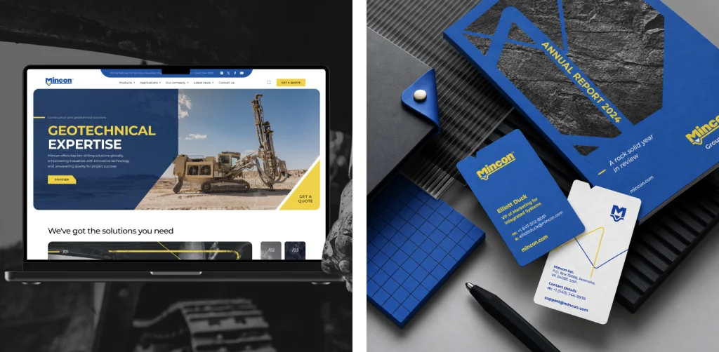
Advertorial layouts, social media templates, product branding for the DTH hammer range, safety apparel, on-site vehicle livery, business cards, annual report cover, exterior and interior signage, and desktop and mobile website designs.
Why an Evolution, Not a Revolution
Mincon’s logo is seen every day on hammers, rigs, hard hats and buildings around the world, and that recognition is a real business asset. A full rebrand would have thrown away decades of trust with drillers. An evolution let Madcraft keep everything customers know and value, the blue and gold, the “M” and the drill bit, while removing the complexity that held the brand back in digital channels. The result is a brand that feels familiar to existing customers, fresh to new ones, and ready to scale as Mincon grows.