Branding That Drives Growth for an Established Print Business
- Product Sub-Brand Design
- Logo & Identity Design
- Graphic Language Development
- Brand Guidelines
- Social Media Assets
- Brand Strategy
- Print Collateral
Industry
Cell Engineering Technology
Platform
Brand Evolution
Region
 United States
About the Client
Digital Print & Promotional Solutions
Sooner Than Later (STL) is a dynamic, multi-disciplinary B2B company specialising in digital printing and custom 360-degree solutions for brands’ promotional and marketing needs, from print and signage to events, retail and merchandise. A trusted, family-owned business with 40 years in operation, STL offers a 24-hour, five-day-a-week digital print service that is unique in the industry.
STL’s name already captured what made it different: speed, reliability and a commitment to deadlines. It needed a brand that expressed that promise just as clearly.
Clients Challenges
STL’s strengths, agility, timeliness and creative excellence, were well known to its clients, but the brand needed to communicate them clearly and consistently to a wider market. The brief brought together several intersecting challenges:
- Turning a name into a promise: “Sooner Than Later” already signalled speed. The brand needed to build on that and make it a clear, client-focused commitment.
- Communicating a broad offering: STL handles everything from printing and signage to events, retail and merchandise. The brand had to cover the full range without becoming cluttered.
- Standing out in a busy sector: For a business that produces other brands’ marketing, its own identity had to feel confident, creative and modern.
- Working across many formats: The identity had to perform on the website, social media, X-banners, vans and stationery alike.
- Consistency in everyday use: Much of STL’s communication is produced in office tools by internal and external users, so the brand needed practical rules that anyone could follow.
The challenge, ultimately, was creating a brand that lived up to its name, one that told clients, in every touchpoint, that their brand would be delivered on time.
Let’s get started! Contact us today to discover how we can help.
Project Goals
What We Set Out to Deliver
STL needed a brand that turned its name into a promise clients could see and feel. The brief brought together several intersecting goals:
- Define the brand’s key attributes: agility, flexibility, timeliness, creative excellence, customer focus and competitive advantage
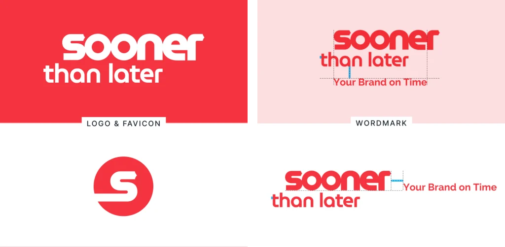
- Design a distinctive wordmark with clear construction, clear space and minimum-size rules
- Create a strapline that speaks directly to clients and builds trust
- Develop a flexible messaging framework for each of STL’s service lines
- Build a bold colour palette and a typography system that works in both design and office environments
- Create a graphic language that conveys movement and builds visual equity over time
- Deliver templates and applications for web, social media, banners, vehicle livery and stationery
Our Approach
Brand Strategy & Messaging
- Worked with the STL team to define who the business is and its six key company attributes
- Developed the "Your Brand on Time" strapline as a direct promise to clients
- Built a messaging framework that extends the strapline across printing, events, delivery, retail solutions, conferences and signageDeveloped the "excelling beyond" strapline, designed to work both locked up with the logo and as a stand-alone headline
- Defined the relationship between the Avectas company brand and the Solupore® technology brand
Identity Design
- Designed the three-word Sooner Than Later wordmark on a construction grid based on the cross stroke of the "t"
- Created vertical and horizontal lock-ups of the wordmark and strapline
- Set clear space, minimum sizes for print and web, colour alternatives and misuse rules
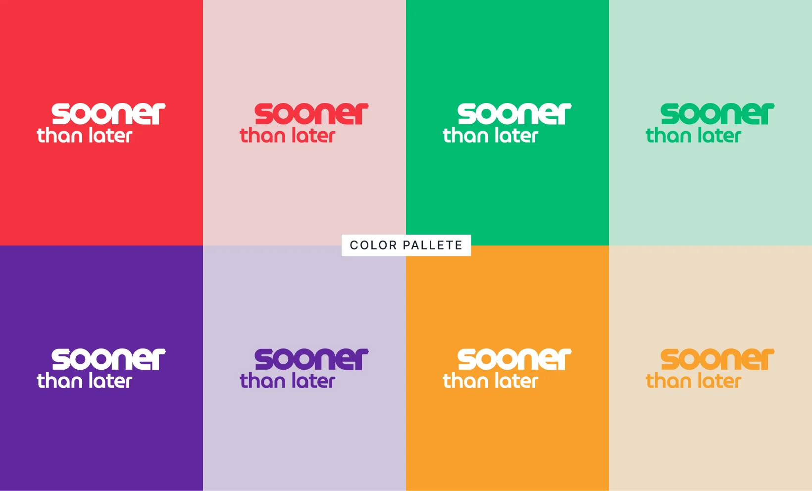
- Built a palette led by Pantone Red 032, supported by purple, green, orange and dark grey, each with 80% and 20% tints
- Selected Raleway as the brand typeface, with Verdana as the fallback for emails, Word documents, invoices and spreadsheets
Graphic Language & Applications
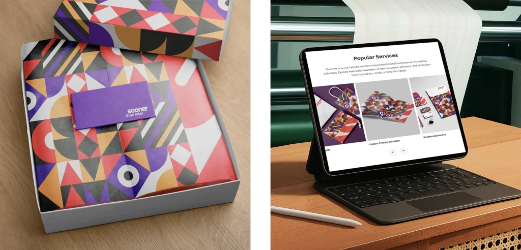
- Developed the "S" icon graphic language using solid, linear and rotational extractions
- Designed the favicon and social profile image, with size specifications for every major platform
- Created landscape and square social post templates, plus a flexible headline tab device
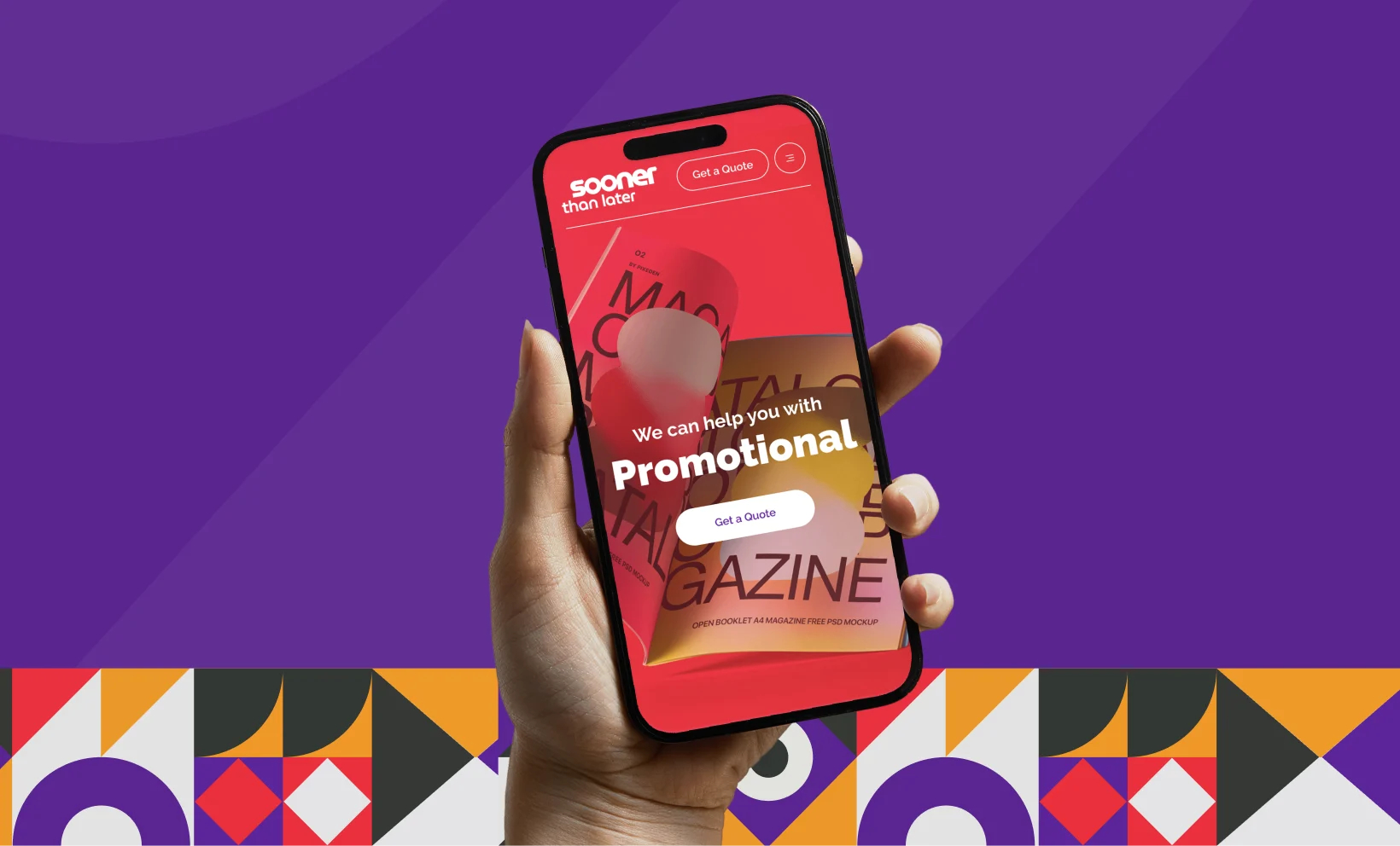
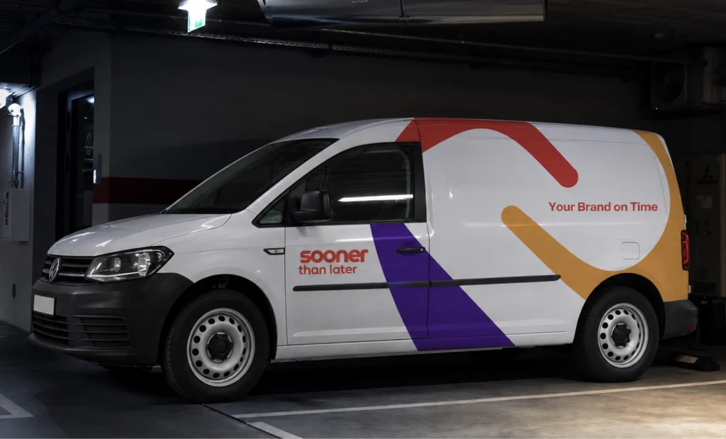
- Applied the brand to website landing, about and sustainability pages, X-banners, a VW Caddy panel van and business cards
- Documented everything in a 31-page brand expression guide
Your Brand on Time
The standout idea behind the STL brand is a strapline that turns the company’s name into a direct promise to every client: “Your Brand on Time”. It speaks to the client personally, reassures them that their brand is a priority, and covers everything STL does, from printing to merchandise. Above all, it reinforces the agility, delivery and efficiency at the heart of the business.
The strapline also works as a messaging catalyst. Its simple, client-first structure flexes naturally across every service line: “Your printing on time”, “Your event on time”, “Your signage on time”, “Your retail solutions on time”. This gives STL a ready-made framework for campaigns, social posts and service pages, with every message reinforcing the core promise.
Visually, that sense of momentum comes from the circular “S” icon taken from the word “Sooner”. Dissected into four quadrants, the icon generates a family of abstract forms through solid, linear and rotational extractions. These forms appear across print, digital and environmental applications, and a version of the “S” device sits on every social post, building recognition wherever STL’s content travels.
Key Deliverables
Wordmark & Lock-ups
A three-word Sooner Than Later wordmark built on a precise construction grid, with vertical and horizontal strapline lock-ups and full usage rules.
Strapline & Messaging Framework
“Your Brand on Time”, plus service-specific variations for printing, events, delivery, retail solutions, conferences and signage.
Colour & Typography System
Pantone Red 032 (HEX #EF3340) as the primary colour, four secondary colours with 80% and 20% tints, Raleway in four weights, and Verdana for office use.
"S" Icon Graphic Language
Solid, linear and rotational form extractions from the circular “S” icon, for use across print, digital and environmental media.
Digital & Social Assets
Favicon and social profile images sized for every major platform, landscape and square post templates, and a headline tab device.
Creative Applications
Website landing, about and sustainability page designs, X-banners, VW Caddy van livery and business cards with die-cut rounded corners and spot UV.
Brand Expression Guide
A 31-page guide covering brand attributes, wordmark usage, strapline, colours, fonts, graphic language, social media and applications.
Why a Promise-Led Brand
In a sector where many print businesses compete on price and capability lists, a clear promise is what clients remember. STL’s name already set the expectation of speed, so we built the whole brand around making that expectation a guarantee. Leading with “Your Brand on Time” gives STL a message that is easy to repeat, easy to extend and true to how the business actually works, while the flexible “S” graphic language keeps every touchpoint feeling energetic and unmistakably STL.