
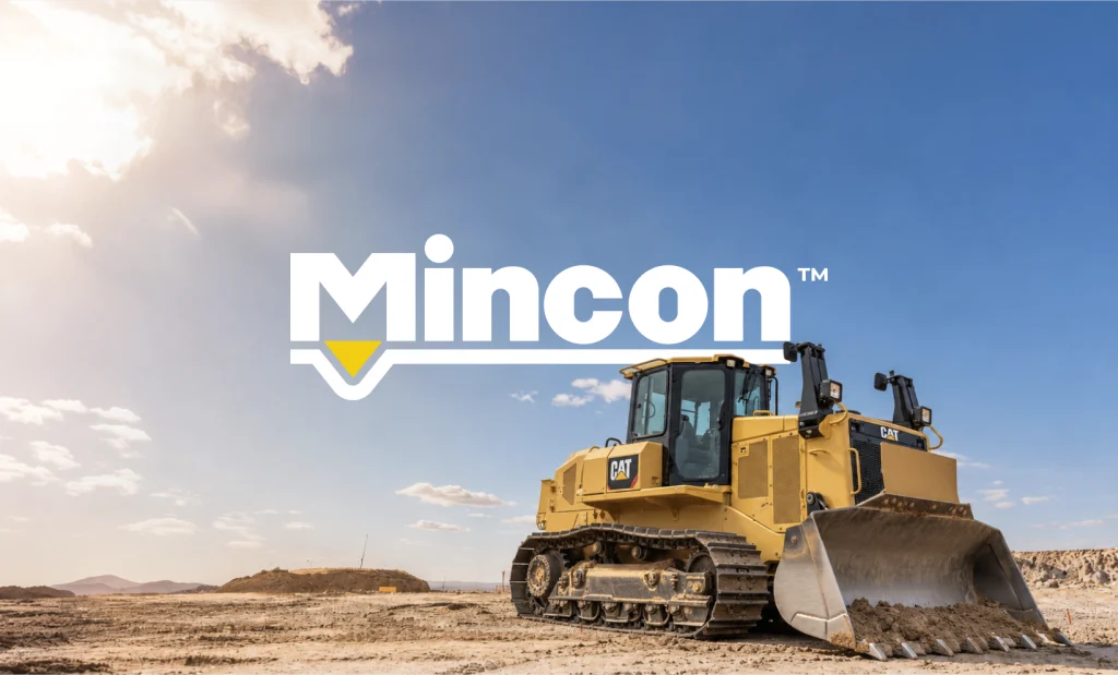
Evolving a Global Drilling Brand for a Digital-First Market
The challenge:
Mincon’s heritage logo was overly detailed, struggled on white and small screens, and felt rigid for a modern, digital-first market.
The strategy:
Evolved the logo, refined the gold, and built a drill-bit-inspired graphic language applied across product, print, signage, apparel and web.
12
peer brands audited
3-step
logo evolution
9
assets redesigned
“Mincon’s mark had decades of trust built into it, so throwing it away was never the answer. We took our cues from the drill bit itself, softening the edges the way conical teeth are rounded, and ended up with a logo that feels familiar to drillers but finally works everywhere it needs to.” — Darryl Betz, Art Director, Madcraft
 Integrated Brand & Website Transformation