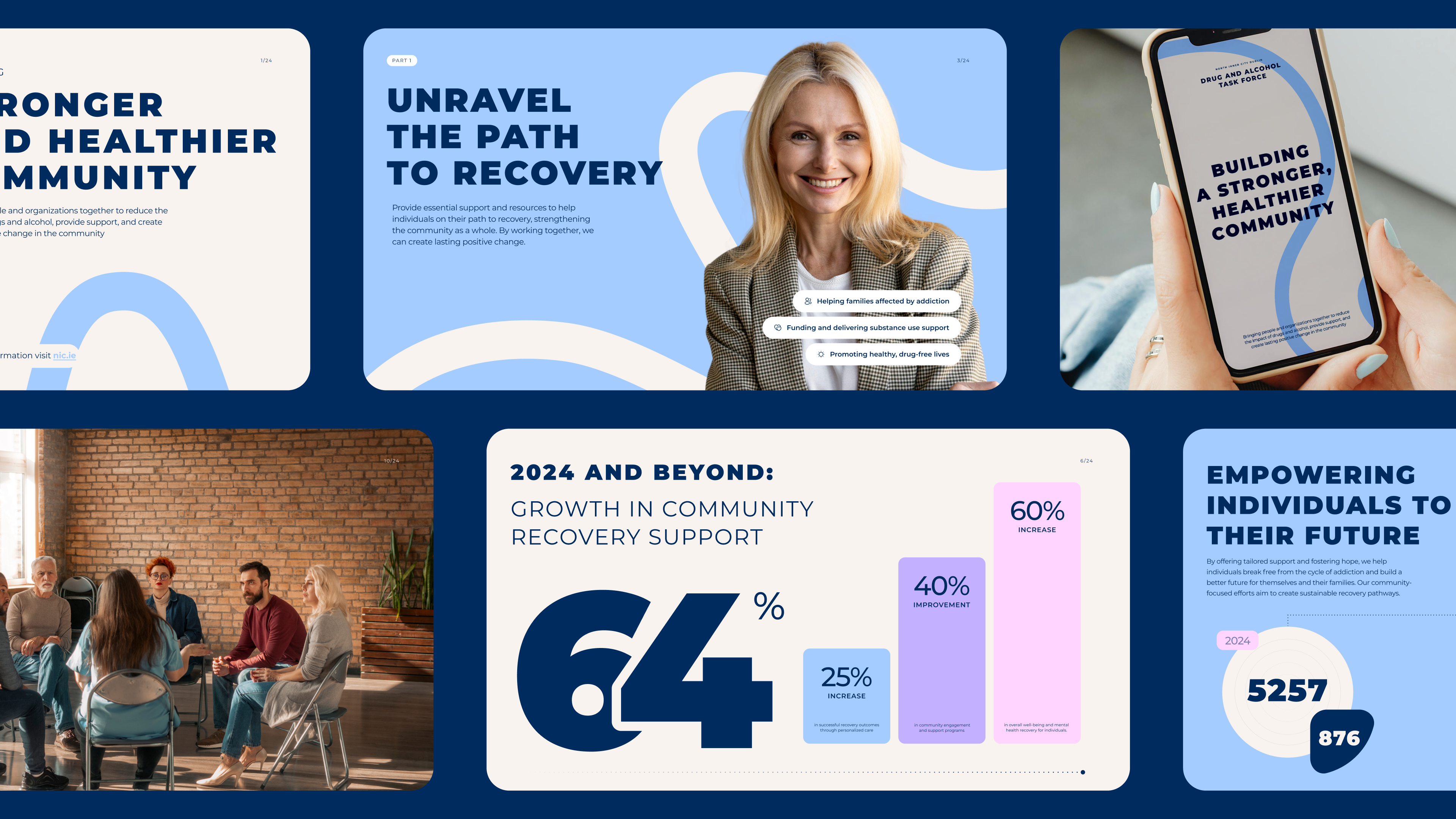
The North Inner City (NIC) Dublin Drug and Alcohol Task Force brings together policymakers, healthcare professionals, statutory bodies, community and voluntary representatives, and elected members to reduce the harm caused by drugs and alcohol in Dublin.
By developing strategies, coordinating support services, and supporting individuals and families, NIC Dublin DATF works to improve the lives of those affected by addiction and to build stronger, healthier communities.
NIC Dublin DATF needed a new brand identity that reflected its role as both a trusted leader and a supportive partner in the recovery journey. The organisation’s mission is deeply rooted in community, care, and transformation, values that had to be visually expressed in a way that felt professional, approachable, and connected to Dublin’s identity.
The challenge was to create a brand that balanced authority and clarity with compassion and optimism, while also ensuring flexibility across digital and printed materials.
We designed a brand identity that embodies support, transformation, and stability. At the heart of the brand is a new logo that symbolises hope and connection.


The emblem depicts a person with raised arms, representing strength, hope, and the support found through NIC Dublin’s work. Derived directly from the same typeface used in the logotype, the mark and text are visually connected, reinforcing consistency and clarity. Its bold, structured design communicates stability and trust.
Drawing inspiration from Dublin’s historic Coat of Arms, the primary palette features soft blue and navy—shades symbolising clarity, strength, and tradition. These colours root the identity firmly in the city’s heritage while reflecting the organisation’s role as a steady guiding presence.
To complement this, we introduced soft pastel accents to add warmth, optimism, and a sense of welcome—reflecting the journey of recovery and new beginnings.
We selected Montserrat for its clean, modern, and trustworthy aesthetic. Bold weights give headlines strength and authority, while regular weights keep longer text accessible and professional. This typographic system ensures readability and consistency across all platforms.
Shapes and forms were inspired by doors and windows—symbols of opportunity, new pathways, and transformation. Curved lines echo the ideas of unity and connection, reflecting the strength of community and the supportive networks that underpin recovery.

The new identity for NIC Dublin Drug and Alcohol Task Force communicates trust, care, and transformation while staying rooted in Dublin’s culture and history. The visual system is flexible, working seamlessly across digital, print, and photography, and adaptable to a variety of contexts where visibility and clarity are crucial. By aligning its visual identity with its mission, NIC Dublin DATF now has a strong, modern brand that reinforces its role as a leader and supporter in the journey toward recovery and change.

Choosing Madcraft for your branding project means partnering with a team that goes beyond visuals to craft meaningful, enduring brand identities. We don’t just design logos—we create complete brand systems rooted in strategy, precision, and purpose. From defining your brand’s story to building proprietary design assets that stand the test of time, we ensure every element reflects your values and speaks directly to your audience. With Madcraft, you’re not just getting a design agency, you’re gaining a creative partner committed to elevating your brand and helping it perform at its best.