Team Madcraft


Your next major B2B buyer is searching on a smartphone, not a desktop.
A “mobile-friendly” site isn’t enough, true mobile-first design starts with the smallest screen in mind.
Speed, clarity, and usability drive more quote requests and calls.
Google ranks your site based on its mobile version first.
A clean, fast mobile experience builds trust and reflects your company’s precision and professionalism.
Madcraft designs mobile-first manufacturing websites that convert visitors into qualified leads.
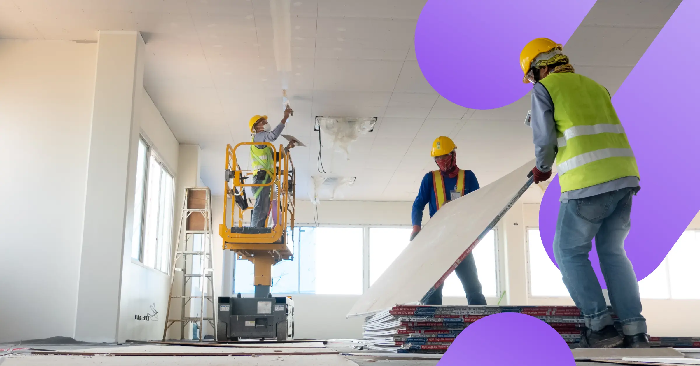
Your next major contract likely isn’t being researched by someone at a desktop. It’s being sourced right now by a project manager on a job site or a plant manager on their smartphone. For companies in the industrial and manufacturing sectors, a website that is just “good” on a phone is actively costing you leads. A mobile-first website for manufacturing is a critical revenue driver.
The stereotype of a B2B buyer being chained to a desk is long gone. Think about your real-world clients: a plant manager on the factory floor, a contractor on a job site, or a procurement officer in a meeting. They’re all using their smartphones to regularly source parts, find emergency contact info, and vet suppliers.
In this fast-paced world, buyers need information fast. If your industrial website design is slow, cluttered, or hard to navigate on a phone, potential customers will simply click the “back” button and call your competitor. A mobile-first site puts your most critical information (like your phone number and quote request form) right at their fingertips.
These two terms sound similar, but they mean very different things.
Mobile-Friendly (or “Responsive”): A website is designed for a large desktop screen and coded to shrink or stack elements to fit on a phone. The result is often functional but clumsy, slow, and hard to use.
Mobile-First: The modern standard. The design process starts on the smallest screen (a smartphone). This forces a focus on what is most essential: speed, clarity, and your primary call to action. The design is then adapted to scale up to tablets and desktops.
A mobile-first approach ensures your site is lean, fast, and easy to use on the mobile device your customers are most likely to use.
A poor B2B website user experience is full of “friction.” We define friction as anything that makes it hard for a user to accomplish their goal.
Pinching and zooming to read text? That’s friction. Trying to tap a tiny “Contact” button with your thumb? That’s friction. A contact form that’s a nightmare to fill out on a phone? That’s the ultimate friction, and it’s a lost lead.
A mobile-first website removes this. It makes “Click-to-Call” buttons prominent, ensures menus are simple, and makes forms easy to fill out. This seamless experience builds confidence and directly translates to more high-value inquiries in your inbox.
This is the most critical technical reason to make the switch. For years, Google has been using “mobile-first indexing.”
In simple terms: Google ranks your website based on its mobile version, not its desktop version.
It doesn’t matter if your desktop site is perfect. If your mobile site is slow, hides content, or provides a bad experience, Google sees this as a bad site. This means a poor mobile-friendly construction website will rank lower than its competitors, making you invisible to potential clients who are searching for your services.
What does a slow, broken mobile site say about your company?
In the industrial and manufacturing world, your brand is built on precision, reliability, and technical expertise. Your website is your digital handshake. If a potential client lands on your site and it looks 10 years old, they may unconsciously apply that feeling to your business.
A clean, fast, and professional mobile experience does the opposite. It builds instant trust. It shows you’re a modern, professional, and reliable partner who is easy to do business with. A strong manufacturing web design reflects the quality of your work