At Madcraft, we specialize in creating brands that embody not just an image, but a purpose. Our recent collaboration with Atire, a leader in high-quality corporate uniforms and workwear, exemplifies this. For Atire, a uniform is more than just clothing; it’s a symbol of pride, performance, and purpose. We were tasked with reimagining their brand identity to reflect their decades-long dedication to professionalism, structured delivery, and unshakable trust.
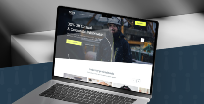
Atire’s existing brand needed to evolve to better reflect its reputation as a premium provider of tailored corporate uniforms. They wanted a brand identity that would capture:
Their enduring professionalism and unshakable trust.
Their dual promise of garments custom-fit to the individual and purpose-built for performance.
Their philosophy that uniforms aren’t just fabric, but a representation of confidence, consistency, and excellence.
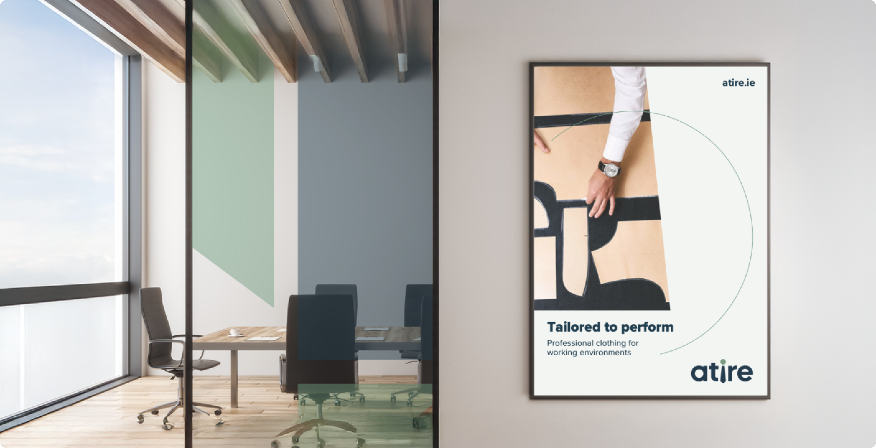
Our solution began with Atire’s core philosophy, which inspired the creation of a strapline that encapsulates their mission: “Tailored to Perform.” This line speaks directly to Atire’s unwavering commitment to quality, precision, and purpose, communicating that every Atire uniform is designed not just to look the part but to empower people to excel in it, whether in the boardroom or on the job site.


The new Atire logo was designed as a powerful and modern expression of their brand ethos. It comprises three elements:
The logo construction centers on the “precision dot” of the tie icon, creating a balanced and recognizable form. Strict reproduction guidelines were established to ensure brand consistency across all mediums.
We developed a muted yet sophisticated primary palette to evoke refinement, durability, and trust:
This palette reflects Atire’s message of enduring professionalism. 10% and 40% tints of Ledger Blue and Utility Green, as well as a 10% tint of Stone Press, add depth and graphic texture—especially in digital channels. A Hi-Viz Yellow is reserved solely for digital Call-To-Action prompts to enhance user experience.
We chose Proxima Nova as Atire’s primary typeface for its clean, versatile aesthetic:
Tie Blade Device
The tie icon was deconstructed into shapes and forms that create a proprietary visual language. These shapes add a dynamic layer of depth and movement to Atire’s visual identity, building visual equity over time.
Precision Dot Device
The “precision dot” is used as a subtle, supportive design element, adding sophistication and motion to layouts while maintaining brand cohesion.

The new Atire branding successfully captures the essence of professionalism, precision, and performance. By combining a clear visual identity, a sophisticated color palette, and proprietary brand devices, Atire now has a flexible and future-ready brand system. This identity positions them as not just a uniform provider but as a partner empowering teams to present their best selves with confidence and consistency.
Strapline “Tailored to Perform” clearly communicates Atire’s promise.
Precision Dot & Tie Blade Devices create proprietary, flexible graphic assets.
Sophisticated Color Palette & Typography evoke trust, refinement, and durability.
Madcraft has helped Atire transform its identity into a timeless, purpose-driven brand, designed to endure, perform, and inspire.
Choosing Madcraft for your branding project means partnering with a team that goes beyond visuals to craft meaningful, enduring brand identities. We don’t just design logos—we create complete brand systems rooted in strategy, precision, and purpose. From defining your brand’s story to building proprietary design assets that stand the test of time, we ensure every element reflects your values and speaks directly to your audience. With Madcraft, you’re not just getting a design agency, you’re gaining a creative partner committed to elevating your brand and helping it perform at its best.